
Image Credit: Image #1: ASHRAE
More Building Science


In Part 1 and Part 2 of this series of articles, we’ve taken a look at what exactly psychrometrics is and defined the top nine psychrometric quantities. Now we’re going to delve into how we can combine those quantities and create the psychrometric chart.
As you might expect, taking nine variables and putting them into one chart puts a lot of information at your fingertips. It also can take a while to figure it all out. On top of all that, having nine different variables means you’ve got a lot of options for how to show them in a chart.
A lot of folks have been involved in the development of the psychrometric chart over the past century. Willis Carrier was the first, with what he called the hygrometric chart in 1904. Richard Mollier from Germany made an important contribution in 1923, as you’ll see in the next section. Aside from that, the other versions of the psychrometric chart out there are mostly specialty charts and curiosities. (For more on the history and variety of psychrometric charts, see Don Gatley’s book, Understanding Psychrometrics.)
In fact, the chart itself has shifted from being a great calculation tool to being more of an educational or illustrative tool. With all the computing power at our fingertips these days, we can get accurate results from smartphone apps and don’t need to try to pull precise numbers off of psych charts.
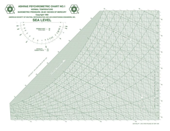
OK, let’s jump in and place those eight psychrometric quantities on the chart and take a visual look this week. In case you’re wondering why I said eight instead of nine, recall that barometric pressure is one of the nine I defined in Part 2 of this series, and that variable determines the scale of the chart. When you change barometric pressure (or equivalently, altitude), you need to redraw the chart. Notice that the chart above says “SEA LEVEL” in big letters.
Dry bulb temperature
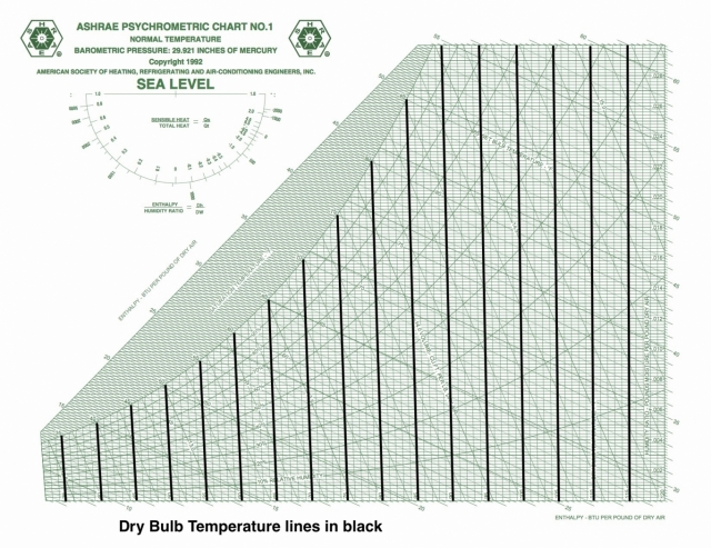
Dry bulb temperature is shown along the horizontal axis. When you draw lines through a chart along which the quantity under consideration remains the same, they’re called isolines. If you look carefully at the chart here, you can see something interesting about the dry bulb temperature isolines: They’re not all vertical and parallel to each other.
That was Mollier’s big contribution to this chart. Carrier originally used dry bulb temperature and humidity ratio as rectangular coordinates and used the various psychrometric relationships to place the rest of the quantities on the chart. One of the problems with this choice is that it makes finding specific enthalpies a bit difficult because the lines of constant enthalpy apply to saturation only, so then you have to put enthalpy deviation curves on the chart to make the adjustment for non-saturated conditions.
There are still plenty of the old-style charts out there, but ASHRAE has settled on the Mollier version with humidity ratio on the vertical axis and specific enthalpy as the other coordinate. If you want to see the dry bulb isolines as vertical and parallel, that’s fine. They nearly are. If you click the lead photo for this article and then zoom in, you should be able to see the difference, especially if you look down at the bottom left.
Wet bulb temperature
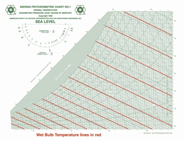
Wet bulb temperature tells you how easy it is for water to evaporate. The New York Times had a really nice article relating wet bulb temperatures to climate change recently, and they defined wet bulb temperature as “a measure of how well you can cool your skin by sweating.” When it’s hot outside, as it has been in India lately, that’s one of the primary ways we keep our bodies from overheating.
The wet bulb isolines are diagonal across the chart, as you see here, and there’s one place where the wet bulb and dry bulb temperatures are equal: at the saturation point. Evaporation doesn’t happen there under normal conditions, at least not without an equal amount of water vapor condensing.
From the saturation point, what happens to the wet bulb temperature as we heat a volume of air? Well, that depends on what happens to the amount of water vapor in the air. If you don’t humidify or dehumidify, you move horizontally to the right, increasing the dry bulb temperature. As you do so, you start crossing different wet bulb isolines with higher and higher values of wet bulb temperature.
For example, if you have air at 100°F and 40% relative humidity, the wet bulb temperature is 79°F. That’s going to be quite uncomfortable. The closer that wet bulb temperature gets to our body temperature, the harder it is for our bodies to lose enough heat to maintain a stable temperature. According to the New York Times article, a physically active person is in danger of overheating when the wet bulb temperature is 80°F.
The psychrometric chart can show us how wet bulb temperature changes as other conditions change.
Specific enthalpy
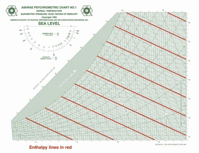
On the ASHRAE chart, the specific enthalpy lines are one of the two main coordinates used to lay out the chart. As you can see here, they’re diagonal and oh, so close to being parallel to the wet bulb isolines. That’s because those two quantities are closely related.
Specific enthalpy tells you about the work and energy in changing air conditions and is given in BTU per pound of dry air in the imperial system of units. It’s only changes that matter here, so if you have any two statepoints on the chart, you can find the enthalpy difference. That tells something about how much energy you’ll have to put into the system or how much you’ll get out when you make the change.
Humidity ratio
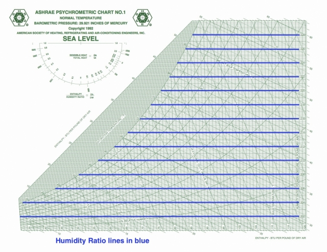
Humidity ratio is the other defining coordinate for the ASHRAE version of the psychrometric chart. As you can see, the isolines are horizontal. In this case, the scale given on the chart is in pounds of water vapor per pound of dry air. Some charts show grains of water vapor per pound of dry air, which is often shortened to grains. (It takes 7,000 grains to make one pound.)
Humidity ratio isolines are horizontal and evenly spaced on the chart.
Water vapor pressure
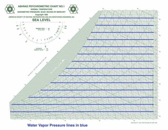
Vapor pressure is rarely shown on the psych chart, and this ASHRAE chart is no exception. I’ve drawn the lines here, and for temperatures below ~120° F, the scale (with units given in inches of mercury in this case) is simply the product:
pWV = 48.11 x W
When you’re doing calculations for vapor diffusion or trying to figure out which way water vapor will travel through materials, you’ll need the vapor pressures for the various locations.
Dew point temperature
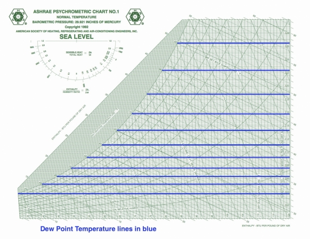
Dew point temperature is yet a third quantity that has horizontal isolines on the psych chart. What this means is that these three quantities are not independent of each other so if they’re all you have, you still don’t know your state point.
Another interesting thing here is that when wet bulb and dry bulb temperatures are equal, so is the dew point temperature. All three have the same value at the saturation point, shown on the curve that bounds the left side of the chart.
Relative humidity
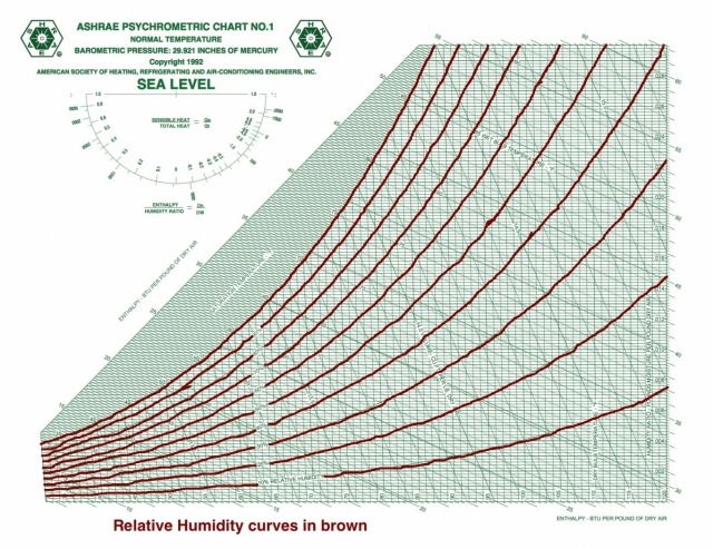
And speaking of curves, the saturation curve is the 100% relative humidity isocurve. When the volume isn’t saturated with water vapor, the vapor pressure will be lower than the saturation vapor pressure and the relative humidity is less than 100%.
Unlike the three preceding quantities with horizontal isolines, relative humidity isn’t related to the other psychrometric quantities under discussion here. If you know RH and any of the other quantities, you’ve got your statepoint.
Specific volume
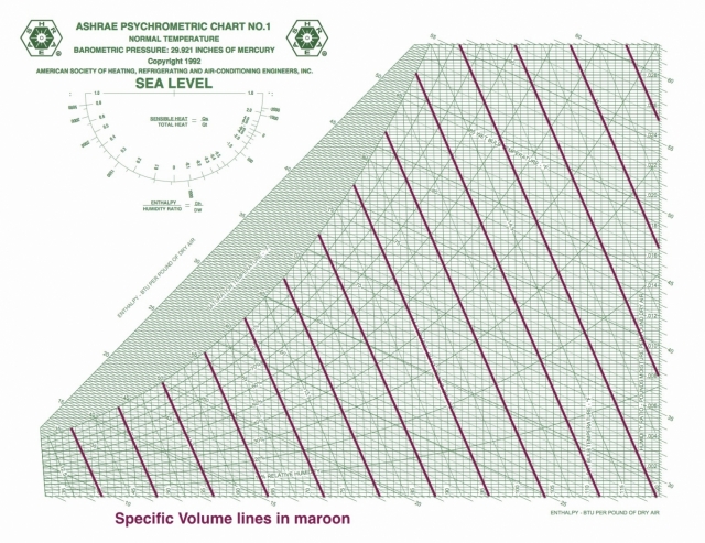
Specific volume shows up as a diagonal line on the psychrometric chart, but it has a significantly different slope than specific enthalpy and wet bulb temperature. It’s also not quite as simple as I made it out to be last time. I wrote that it’s just the reciprocal of the density, but I glossed over a detail that may or may not be important in what you do.
As with the other psychrometric ratios here (specific enthalpy and humidity ratio), the denominator is not the mass of the moist air. It includes only the dry air component. So its units (in the imperial system) are cubit feet per pound of dry air. Since the water vapor component is usually small, however, the specific volume defined this way isn’t greatly different from the volume per pound of moist air.
Understanding the chart
OK, so there are the quantities in the chart. By studying those individual charts, you can see how the different quantities change. For example, changing dry bulb temperature without humidifying or dehumidifying the air has no effect on dew point temperature, humidity ratio, or vapor pressure. And what happens to the relative humidity of air as it passes across an evaporator coil in your air conditioner?
So now we’re ready to start doing the fun stuff with the psychrometric chart. Next time we’ll take a look at some different processes like air conditioning or dehumidification. Stay tuned!
Allison Bailes of Decatur, Georgia, is a speaker, writer, energy consultant, RESNET-certified trainer, and the author of the Energy Vanguard Blog. Check out his in-depth course, Mastering Building Science at Heatspring Learning Institute, and follow him on Twitter at @EnergyVanguard.
Weekly Newsletter
Get building science and energy efficiency advice, plus special offers, in your inbox.


3 Comments
more doc
I've grown fond of
http://techno-fandom.org/~hobbit/hse/psych_annot.gif
which I dug out of some old paper whose reference is long lost,
cleaned up a bit, and added a couple of the basic formulas for
energy calculations. I find it a little easier to read than the
ASHRAE tangle, and copies are tacked up in strategic locations
around the house.
A discussion of some of the other charts for different elevations
and which way the various scales shift while creating them would
be really useful too!
_H*
Response to Hobbit_
The one you like uses dry bulb temperature as the other coordinate, which means you've got to use the enthalpy deviation curves for your energy calculations. That's what I consider a tangle.
Great series
Thanks, Allison, for attempting to drag us science-illiterates along. Can't wait for the rest of it.
Log in or create an account to post a comment.
Sign up Log in