
More Green Building Curmudgeon


While this post has little (or maybe nothing) to do with green building as most of us understand what it means, I find myself seeing some terrible residential design work in my travels, and I feel it deserves to be addressed.
Where design quality can intersect with green building is the subjective concept of “beauty.” The Living Building Challenge has a Beauty Petal as part of the program requirements. According to the website:
The intent of the Beauty Petal is to recognize the need for beauty as a precursor to caring enough to preserve, conserve, and serve the greater good. As a society, we are often surrounded by ugly and inhumane physical environments. If we do not care for our homes, streets, offices, and neighborhoods, then why should we extend care outward to our farms, forests, and fields? When we accept billboards, parking lots, freeways, and strip malls as being aesthetically acceptable, in the same breath we accept clear-cuts, factory farms, and strip mines.
While the Living Building Challenge recognizes that “mandating beauty is, by definition, an impossible task,” it is worthwhile to look at buildings and their details, and to seek out thoughtful, attractive designs.
Inspired by what I believe to be objectively hideous details in a townhome development I drive by periodically, I searched for common finish details that are too often poorly conceived and, in my opinion, unattractive. While most of these don’t affect a building’s performance, some have a negative effect on durability, and they definitely have a negative effect on my mind when I have to look at them.
Up until about 60 years ago, most residential architecture was traditional, and followed common rules and proportions. There were plenty of miscalculations that led to the occasional odd detail, but in most cases, those were honest mistakes that made little difference to the overall design, and sometimes added a bit of charm.
Starting after World War II, the need for housing expanded rapidly and the industry transformed from a mostly craft-based business to a production-product, with design often the first thing sacrificed in the process. Although there are some production and custom builders who create carefully designed homes, the vast majority of single-family construction lacks much in the way of quality design and detailing.
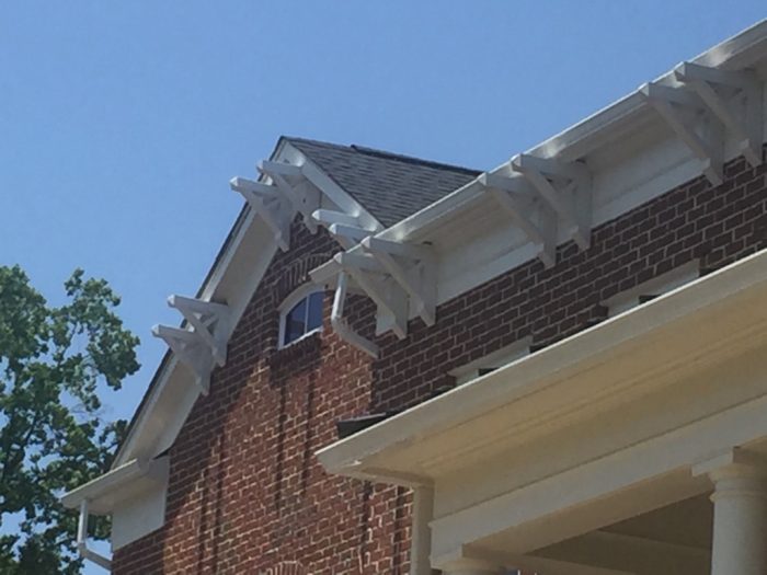
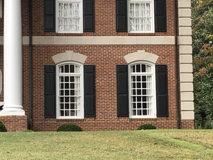
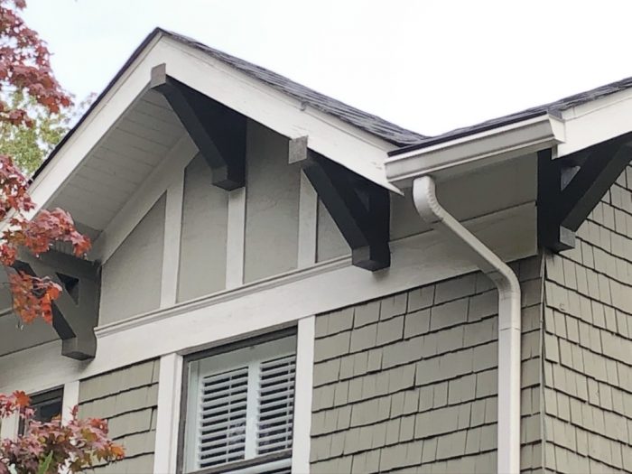
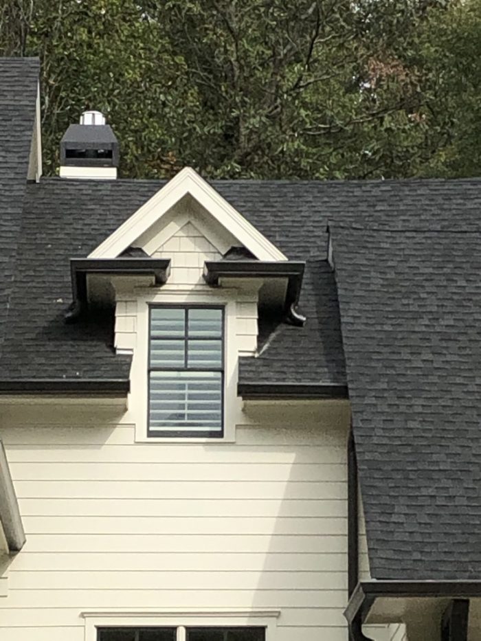
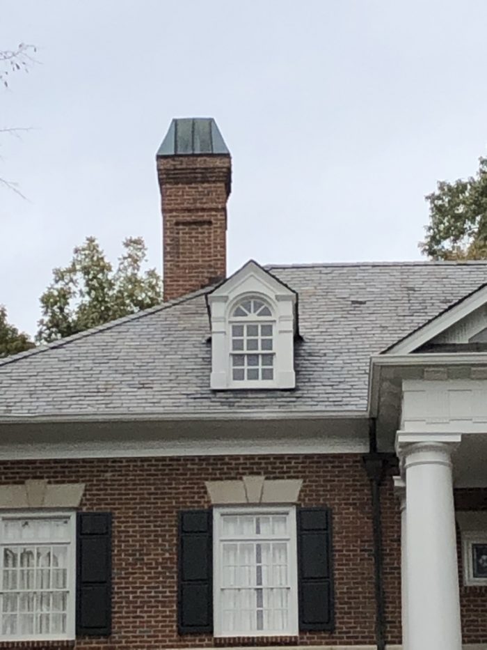
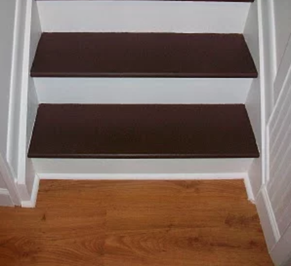
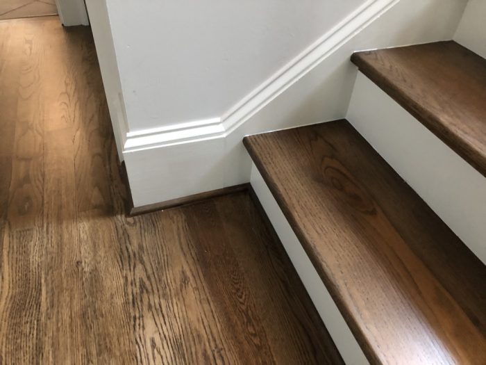
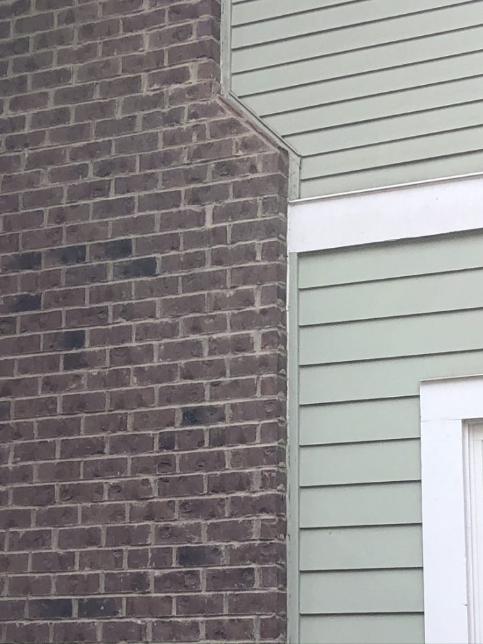
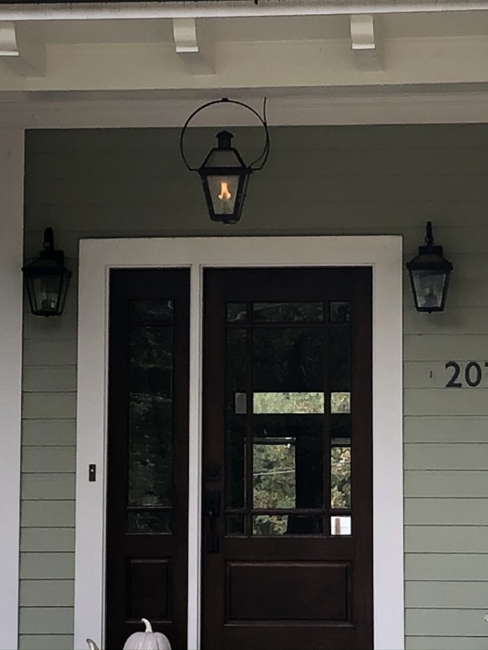
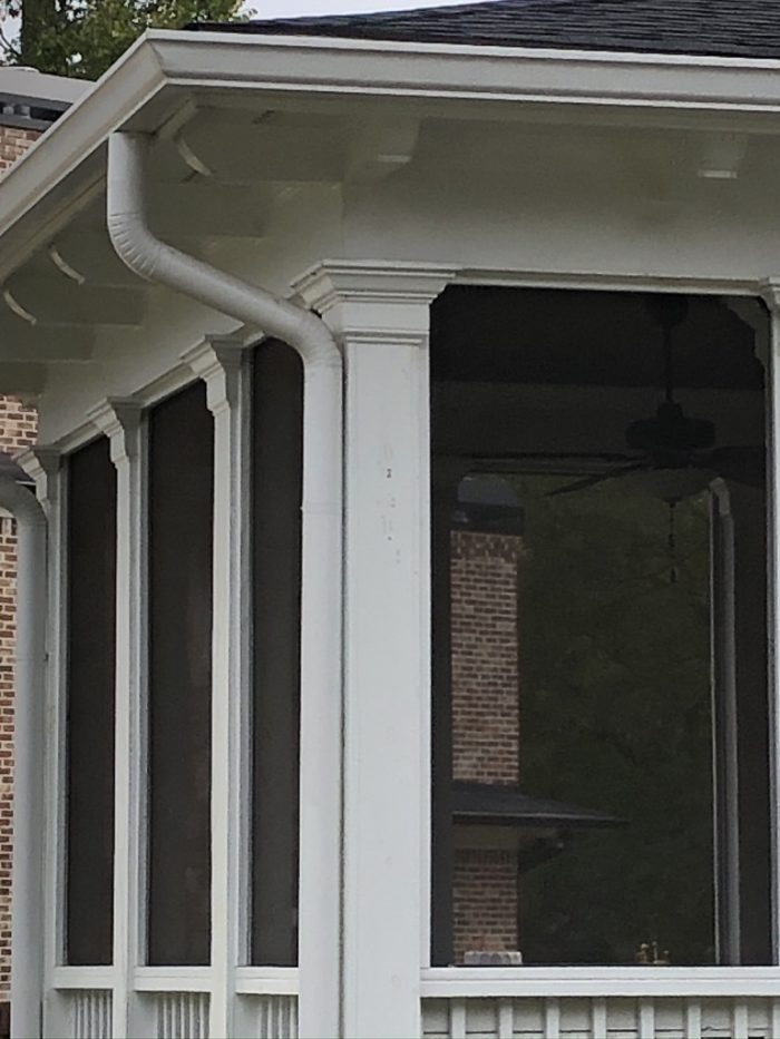
Some of my biggest pet peeves these days include badly designed arched and round-top windows, bird box soffit returns, poorly proportioned columns, pointless (and ugly) pseudo-Craftsman brackets, poorly proportioned window lites, brick ledges that stick out around foundations, “shakes” that look nothing like shakes, and shoddy interior stair trim.
Green Curmudgeon’s architectural pet peeves
The photos below show some poorly designed architectural details, and some better alternatives. Sure, some are a matter of aesthetics alone. Others may actually fail. Also, I’m sure some readers will disagree with my opinions. I’m OK with that. That’s what the comments following the article are for.

Yes, it often comes down to taste
These are just a few examples of what I see happening in new homes, as well as renovations, and additions. With a little extra thought, details like these could be different—better looking and more durable. In some cases there might be a slight extra costs, while in others, costs could be lower by installing appropriate designs which are often simpler.
It does come down to taste, and I suppose some people either prefer inaccurate details on faux historic designs or aren’t knowledgeable enough to understand the difference. Maybe I shouldn’t cast aspersions on other people’s taste, but in the case of details such as some of these columns and brackets, owners may not be bothered by the design, but when they need to repair work on details that have deteriorated prematurely, that is an unnecessary waste of time, money, and resources.
-Carl Seville is a green builder, educator, and consultant on sustainability to the residential construction industry. After a 25-year career in the remodeling industry, he and a partner founded a company, SK Collaborative. Photos courtesy of the author.
Weekly Newsletter
Get building science and energy efficiency advice, plus special offers, in your inbox.

39 Comments
Mr. Seville,
Perhaps you might also enjoy perusing through ---> https://mcmansionhell.com/
Was about to post this link. I enjoy that site perhaps a little too much.
Indeed.
Thanks for the reminder, that is a great site.
Here's a YouTube speech by the McMansion Hell founder:
https://youtu.be/68c2M4r9oQg
I'm a fan of her website, but that talk she gave was rather poor. Some people just aren't good at it, and shouldn't be doing TED talks.
I'll have to look, but I imagine she checks all the right boxes to be asked to speak.
The real trick is to learn the lessons from the past, not just the good ones but the bad ones as well including the ones that took a good coating of lead paint in order to make them hold up over time. That includes being aware of regional variations, looking for simple rules of balance and proportion and taking those lessons forward, regardless of style.
Also, take the No Pork Chops or "bird boxes" pledge.
The thing about bird boxes is that they don't look as good as classical returns, but they also don't allow places for birds and squirrels to rest. For that reason I prefer bird boxes. When form and function conflict, I will always choose function. Engineering is more important to me than architecture.
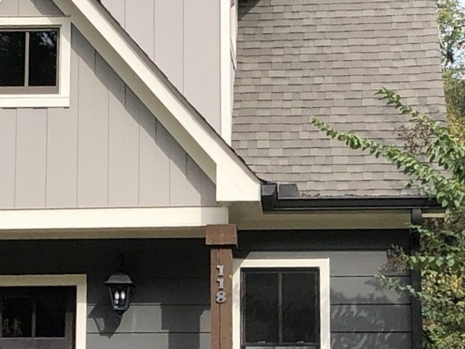
From a purely practical standpoint neither bird boxes or classical returns work as well as ending the soffit at the wall plane.
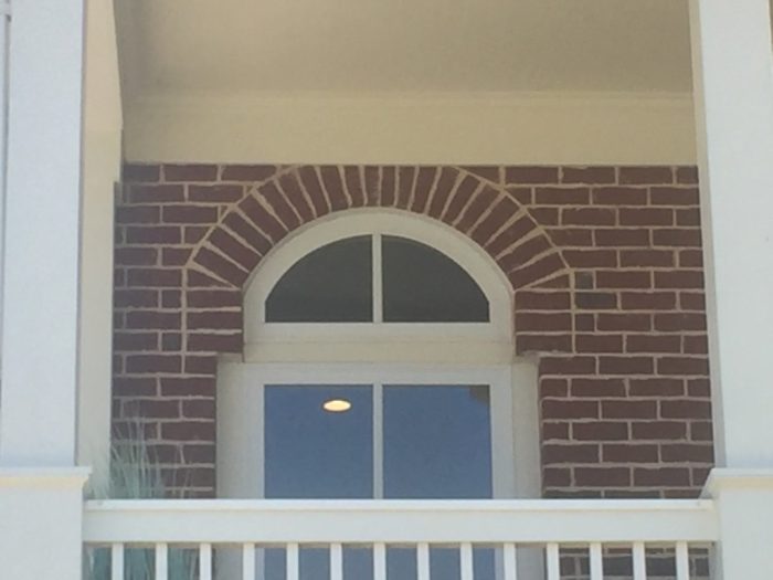
That freise board may look better not interrupted by the window head casing. Underground utilities would help a lot also.
I agree. See my post #6. For some reason the owner decided to paint the window trim a different colour interrupting the frieze board. The switch to an electrical mast also caught me by surprise.
I don't love it but it is better than a bird box.
The amount of trained and available skilled carpenters and tradesmen has been steadily declining each year. The building trade is in a very short supply of skilled labor. So they have resorted to hiring cheap framers who only know how to work a nail gun and must do so quickly so they can frame up a dozen cookie cutter houses.
Fake dormers, fake glulam beams made out of foam and plastic, tacky fake shutters and other such nonsense as shown in this article are now the standard. In other countries like Germany, one has to have a college degree in masonry and flatwork in order to do skilled labor. Here in the USA, it's mainly the cheapest labor workers they can find. The better skilled workers are usually doing custom homes $$$.
Traditional architectural details in which we often find beauty are not entirely arbitrary. Form follows function; designs which rot away in reality also do so in our culture. So I think there is a definite connection between building green and observing good architectural design. Thoughtless "innovations" that fail are by definition wasteful. This could be extended to include details that people will inevitably change even if they have not failed in material sense.
Carl,
I agree - and it was good to see you walk the walk when you built your 0wn well-prop0rtioned and detailed house.
I'd love to be able to say the answer is to hire an architect, but to be fair some of the things you highlight came from them. The extended brackets were popularized by the Arts and Crafts movement, finding their most prominent home in the works of Green and Green. More recently the deliberate mannerism of the Post-Modern movement brought us the truncated arches and lopped off columns. That being said, you are a lot more likely to end up with these odd details when you buy plans from a developer than someone who has at least had to spend some time learning architectural history.
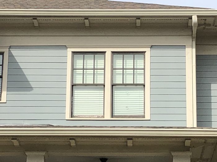
One aspect of house design that doesn't get much attention is that there is often a fairly large difference between what a designer draws and an owner builds. A good proportion of the houses I've designed have had large alterations during construction - with unintended consequences. I always stress to clients that while it's their house, and they are of course free to built it any way they want, it's a good idea to call me first so I can point out the implications of the changes they are thinking of.
As an example, this house was designed with corrugated metal as the cladding for the second storey, and during construction the placement and size of the windows was changed. When you look at it, something seems off. The changes are a large part of why that is.
Everyone should own a copy of Marianne Cusato's book Get Your House Right.
It's a really good and easy to follow guide on how to make these details work correctly and how to avoid the ugly mistakes.
Good call Andy. I highly agree.
If you are designing something traditional and aren't confident in your proficiency with the style, Marianne's book is well worth every penny and can save you from making common mistakes, both egregious and subtle.
I have a love hate relationship with this very classic New England detail. It's expensive, super classy, not logical and lovely. There are variations, mostly involving the frieze and corner boards but the basics remain the same. And are often misinterpreted.
Another detail that immediately jumped out on the first "good" example, shutters that don't match the window. In this case they're a bit narrow, but more so being square shutters on an arched window.
Agree about the shutters, I didn't really notice them, I was using the window as an example of proper proportions. Looking at it they are pretty stupid. Thanks
Agree with Brian about the shutters,I thought this was going to be another 'bad' example. A European trade school would never accept the zipper coursing on the brickwork showing on this example either, resulting in a visually weak half brick spring point for the left hand arch. You say it's a historic house, is this veneer work or solid masonry? I suspect if the latter the masons would have known better and set up their openings to the brick perpends in the first place.
This is the article I've been waiting for from GBA. The examples that the author cites are but a few of the endless examples of where most of our modern buildings are failing. And they are also the reason that I shifted our company's focus from Green Building to Historic Preservation. in the process of working on old buildings you learn about quality Craft and Design, and there's nothing more worthwhile than restoring and preserving a well crafted historic building.
To answer the question "When we accept billboards, parking lots, freeways, and strip malls as being aesthetically acceptable, in the same breath we accept clear-cuts, factory farms, and strip mines."
Because billboards and ugly siding are aesthetic, and clear cuts, factory farms and strip mines impact the real physical world.
I think the opposite is more likely to be true. Many resources are wasted on a pointless aesthetic. People will pay a lot more to buy a bigger, prettier, more wasteful house or truck than a smaller more efficient house or car.
The greatest archi-torture detail I've seen in the past 20 years was on this home in Florida. Note the location of the "shutter-applique". Torturous on so many levels: function, size, beauty, common sense...
Is it possible the builder came that part of the house and said, "The design guidelines say that we have to have shutters on the front of the house...and, this is the only window. They don't fit NEXT to the windows...oh, wait, there's plenty of room back here. Perfect! Job well done!"
It's stuff like this that makes architect Bob Borson's (www.lifeofanarchitect.com) face hurt. UGH!
Chris, I think that is a double wide trailer with an upgraded skirt. It's called housing. Looks like a 3/12 pitch roof, consult thy speed square.
Not a proud moment for mankind when on one side the scale has 10,000 sq ft "party barns" built and barely lived in and this shack built from 2x3 on steel frame is a persons pride and joy, and we live in the first world. It's not right to pick this apart, not everyone can afford luxuries. Yes it is ugly.
James Someone,
I really appreciate your point, about this likely being the pride and joy of the person living in this home. When I look at this photo I see a well maintained and nice looking dwelling. The screened porch, covered parking and nice lawn are what stand out to me.
The truth is, many prideful, hard-working people in this country and around the world would be happy to have such a nice place to live as this. Even with the shutters installed in such a quirky way.
Articles like this and the comments they generate stand out to me as the exception to otherwise great content.
Aaron
Typical warm climate manufactured home.
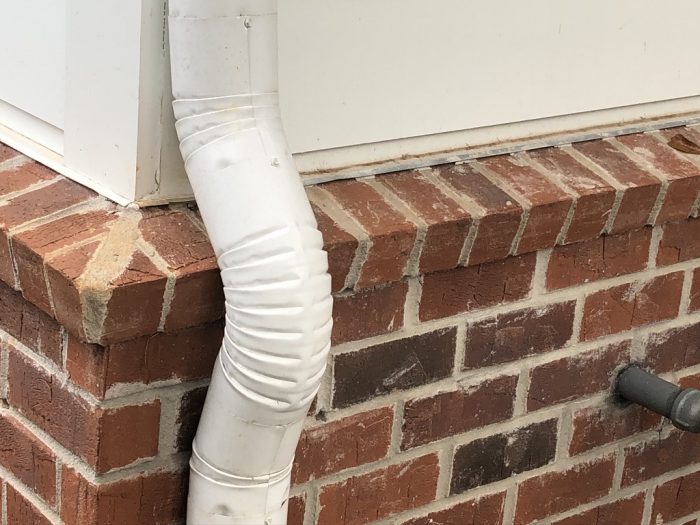
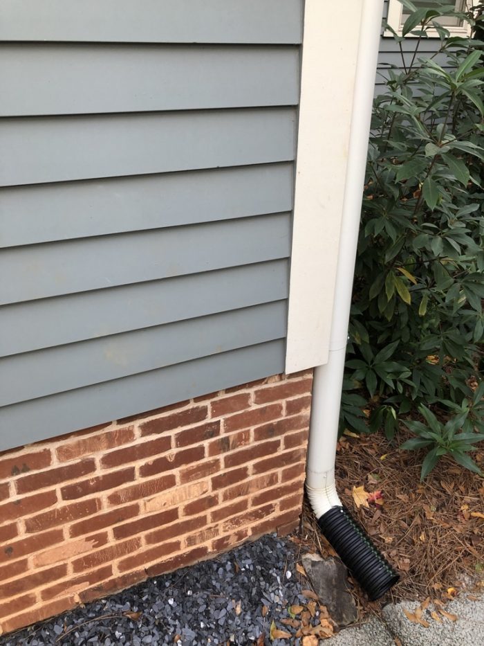
In addition to being ugly, wouldn't the brick ledge atop the foundation wall (with all those mortar joints) allow in a great deal of water behind the brick? I've seen renovation shows where people acknowledge that brick window sills are a terrible design choice for just that reason and recommend solid stone or concrete sills.
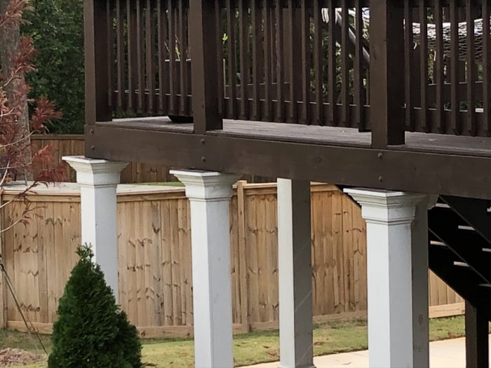
And, how about toothpick sized deck or porch columns?
Scott,
Back in the lat 80s we did a condo project in Ottawa where we specified concrete sills and caps on the masonry, but the developer substituted brick instead. There were problems within a year and a flurry of lawsuits. The insurers ended up replacing them all with the c0ncrete ones originally called for.
Scott - the brick foundation sill is not as much of a water trap around here as it is typically the facing on a poured in place concrete foundation. As long as the rowlock is sloped enough there won't be any water intrusion into the structure. It mostly just looks bad, as do toothpick deck columns. Thanks for the picture. This could become a great rouges gallery.
Looks like a conversion of a single family into a duplex.
The unbraced deck posts would be illegal in NC and I suspect many other places. Tall deck structures fail in shear and people have died as a result
Shortcuts.
It is so much quicker and easier to charge in and build rather than to consider design beforehand. This is why 99% of US housing is constructed without an architect, with little more than a floor plan and "suggested" elevations.
I thought you were going to make the link between considered design and energy efficient, well-constructed buildings that are the focus of this website. That would be the point I'd take away from this article. These annoying little visual detail problems are indicative of the failure to design, to consider a better way of building. Aesthetic problems are symptomatic of issues beneath the skin. It's about character. I find that a building with annoying exterior detailing likely has similar failures in the envelope, structure, HVAC, plumbing, and electrical systems. The link between aesthetic problems and "functional" problems is real.
A poster above alluded to preferring engineering function over architectural form, but if you study design a little while, you realize they are the same thing. An ugly "scientifically correct" building still has character issues that make us question the validity of the science.
I was the poster who alluded to preferring engineering function over architectural form *when they conflict*, which is not very often. Can you tell me how classical eave returns are as functional as bird boxes? Or how bird boxes are scientifically invalid?
Both are purely aesthetic devices, neither has any scientific purpose. Cornice returns started in the Renaissance when breaking Classical orders, "pork chops" not until late 19th century aesthetic reconciliation of horizontal soffit eave venting and sloped gables.
Functionally speaking, the pork chop is a waste of material. There's no reason for eave soffit venting to go past the house wall. There isn't any venting possible up a gable's ladder truss. Clipping the soffit back to the body of the house and letting the gable "fly" past would save material and cost. But the fillet of the soffit between house and eave looks weird because we've been looking at cornice returns for five hundred years. The pork chop is a short cut of added material that ignores historical precedent.
Speaking of technology, science, and engineering—wouldn't it be great if our industry abandoned attempts to imitate historical styles in modern materials? Nobody wants to use historical dental or medical methods, but we somehow want historical-looking buildings designed before glass, insulation, clean heating, cooling, pollution controlling exhaust, vapor control, and air sealing. Pretending is inefficient and causes unintended problems. (Like our pork chop and most of the other examples in the article.) Modern materials designed on their own terms improve health and comfort ten fold over old buildings without the expense of pretending. It seems like an engineering-minded culture would be open to this, but modern architecture seems a hard sell everywhere other than car commercials.
Steve - you make an interesting point about not imitating historical styles with modern materials. I personally happen to prefer traditional architecture over most modern designs, so I have an interest in properly designed and constructed historic details, (without being a strict classicist). And while I don't prefer modern architecture in general, I am fine with it when carefully designed and constructed. One of the main benefits of traditional, vernacular architecture is that the designs tend to be appropriate for the climate including overhangs when useful for rain and sun protection, shingle lapped siding and trim for moisture protection (realizing that the WRB below is now what serves that purpose), and the use of trim to create smooth transitions between planes and materials, something that becomes complex, expensive, and not particularly durable in many modern designs. Further, I often see contemporary designs that pay little if any attention to performance and durability, instead going for form completely over function. This often requires heroic efforts in the field (usually not properly undertaken) to provide a properly performing building, something that would have been much less difficult with a more traditional design. I am fine with well thought out contemporary designs, I just do not see very many.
Carl, according to this article it takes less than 30 seconds for rain to pass through a brick veneer, so I would think having a brick rowlock would make things much worse, no matter how sloped it is (water running down the wall in addition to rain hitting the veneer at an angle).
https://www.buildingscience.com/documents/published-articles/pa-water-managed-wall-systems/view
WRT the foundation veneer in this pic this is often done when the veneer is an afterthought and I agree it is a functional abomination, creating a water table right at the most vulnerable point of the wall where framing meets masonry. I just want to mention though that a veneer of brick or stone on the outside of the framed wall plane can be a useful detail if it extends high enough to protect the the wood framing and siding from water damage when the exterior finish grade surface is high. Of course proper flashing details are essential, but these are much easier to manage when the abutment is elevated significantly above plate level. The second and third photographs are of a stone plinth course used in this way. Traditional craftsman homes commonly use this detail to create a wainscot course of brickwork up to window sill level or higher. It's visually very satisfying as a grounding connection for the home as well as a protection for vulnerable siding or as in this case stucco.
Log in or create an account to post a comment.
Sign up Log in