

More Building Science


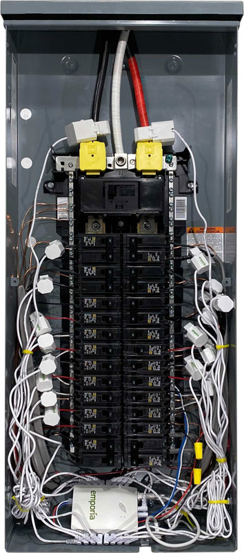
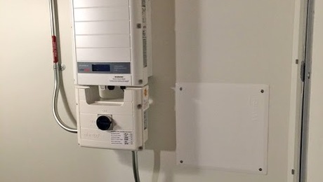
In June of 2022, I wrote about the Emporia Vue home electricity monitoring system I installed at my house. I’ve posted data on LinkedIn and in some other articles since then. Now, though, I’ve got a whole year’s worth of data, so let me overwhelm you with graphs today. I’ll discuss each one briefly and give some of takeaways from the data. You may see more in there, too, so please comment and let me know what you see or about your own monitoring experience.
A note about the time period covered: All but one of the graphs below go from July 1, 2022 through June, 30 2023. The only one that’s different is the Vue vs. Georgia Power comparison. That one goes from July 2 through June 30 because that aligns the Vue data with the utility billing periods. It’s not exactly by calendar month either. Also, our home has been all-electric since 2019, so this is all of our energy use.
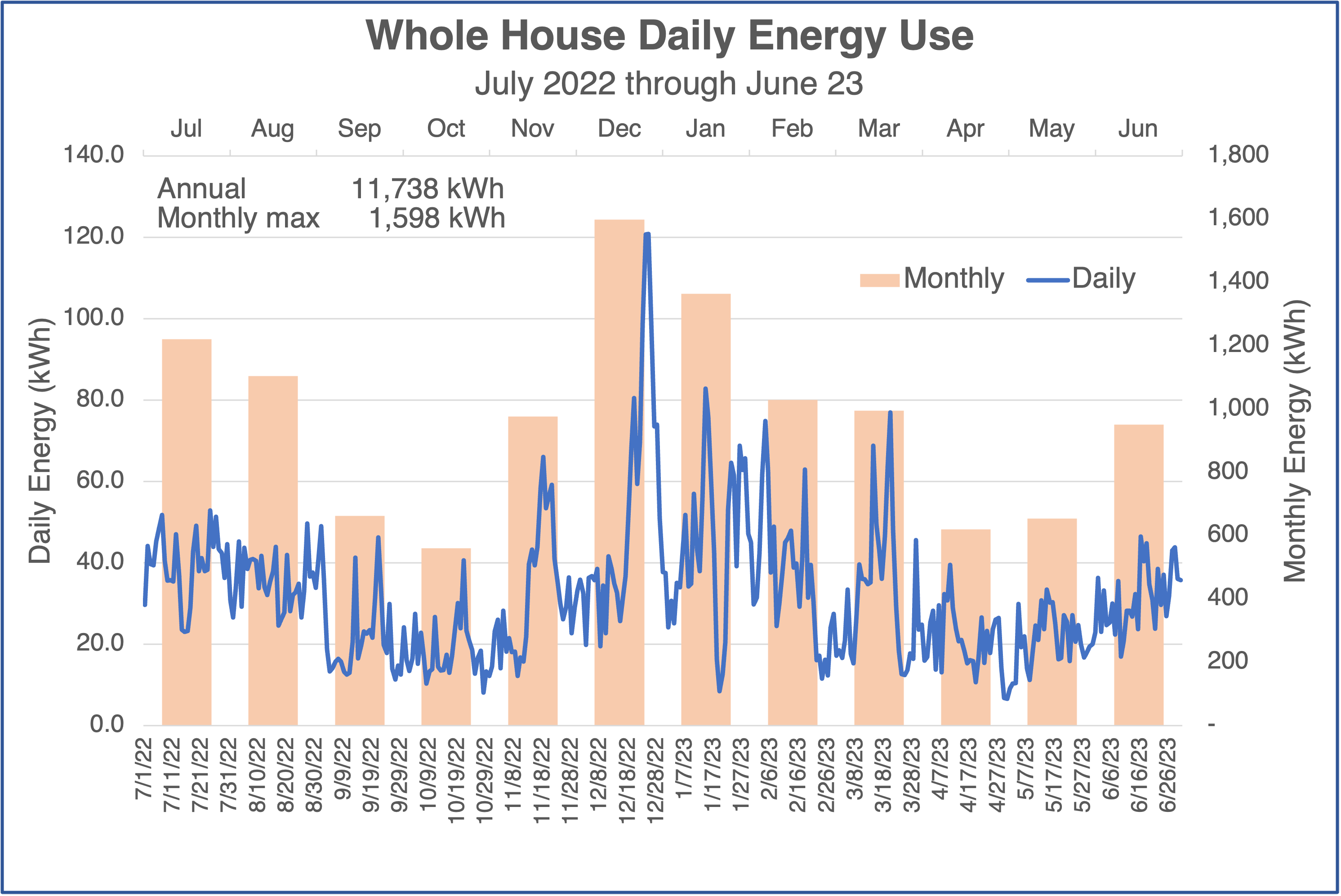
Whole-house electricity use
First, let’s look at the daily and monthly data for the whole house. The graph below shows both, daily in blue and monthly in columns. One thing that’s clear from the graph is that we use more energy in winter than in summer. (Is that because we use more energy for heating than for cooling? Hmmm.)
Also, the biggest daily spike and monthly consumption coincides with the arctic blast we had in December. The total for the year was 11,738 kilwatt-hours (kWh), so about 1,000 kWh per month. The biggest month was 1,598 kWh and the smallest 560 kWh.
If you’re like me, you’re probably wondering how this home electricity monitoring system compares to data from the electric utility. We’re with Georgia Power, and I track those data in a spreadsheet so the comparison is easy to do. You can see it in the graph below.
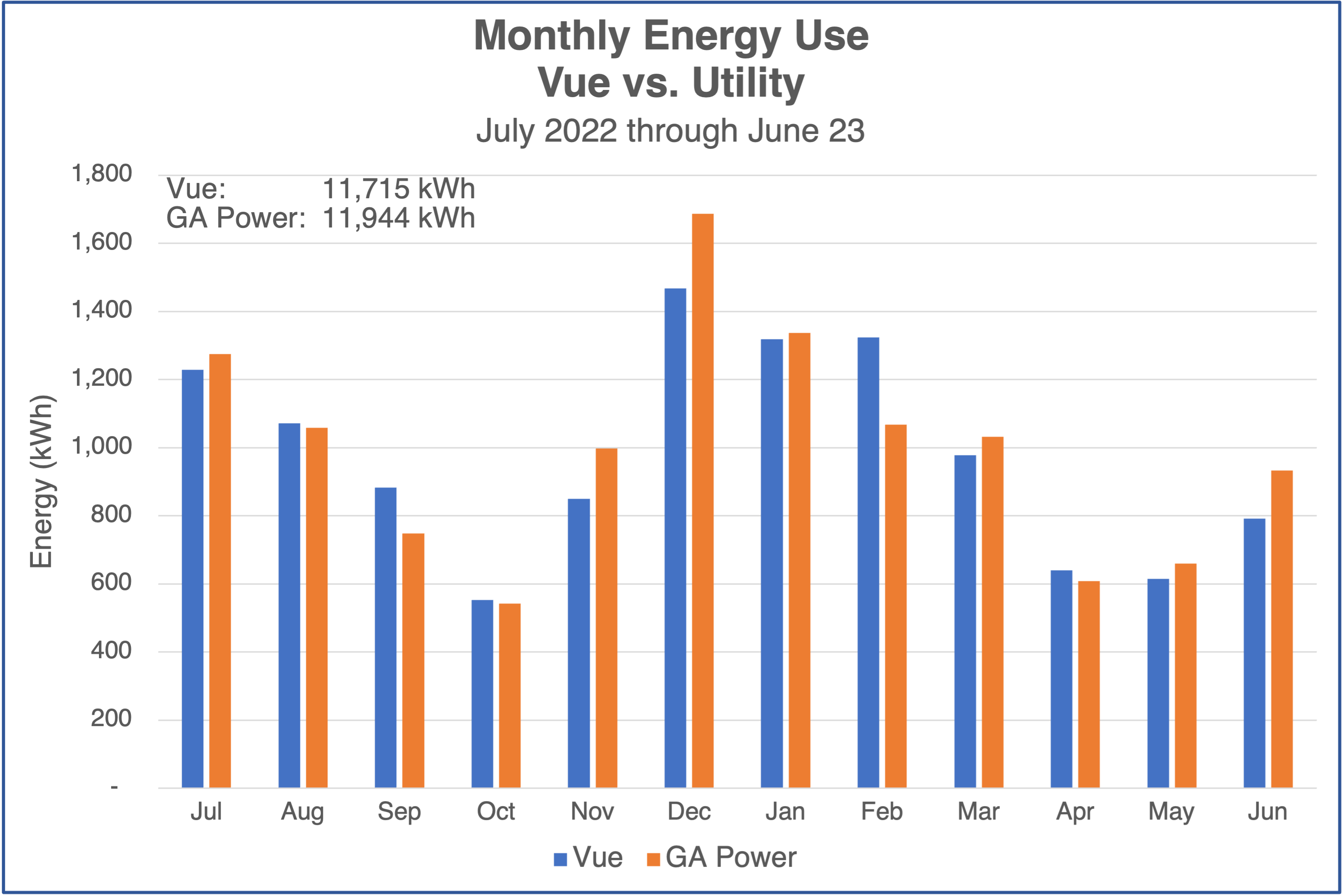
It’s interesting that the annual numbers are really close. The difference is only 2 percent. But the monthly variation can be quite large. Five of the 12 months had differences in the double-digit percentages, with the highest being 19 percent. It also doesn’t favor one over the other. Sometimes Vue is higher; sometimes Georgia Power is higher.
Annual use by select loads
Let’s break down where all the electrical energy is going. The graph below shows some of the individual loads. (HP stands for heat pump.) The biggest is my main heat pump (called “Attic HP” below). It accounts for 41 percent of our electricity use.
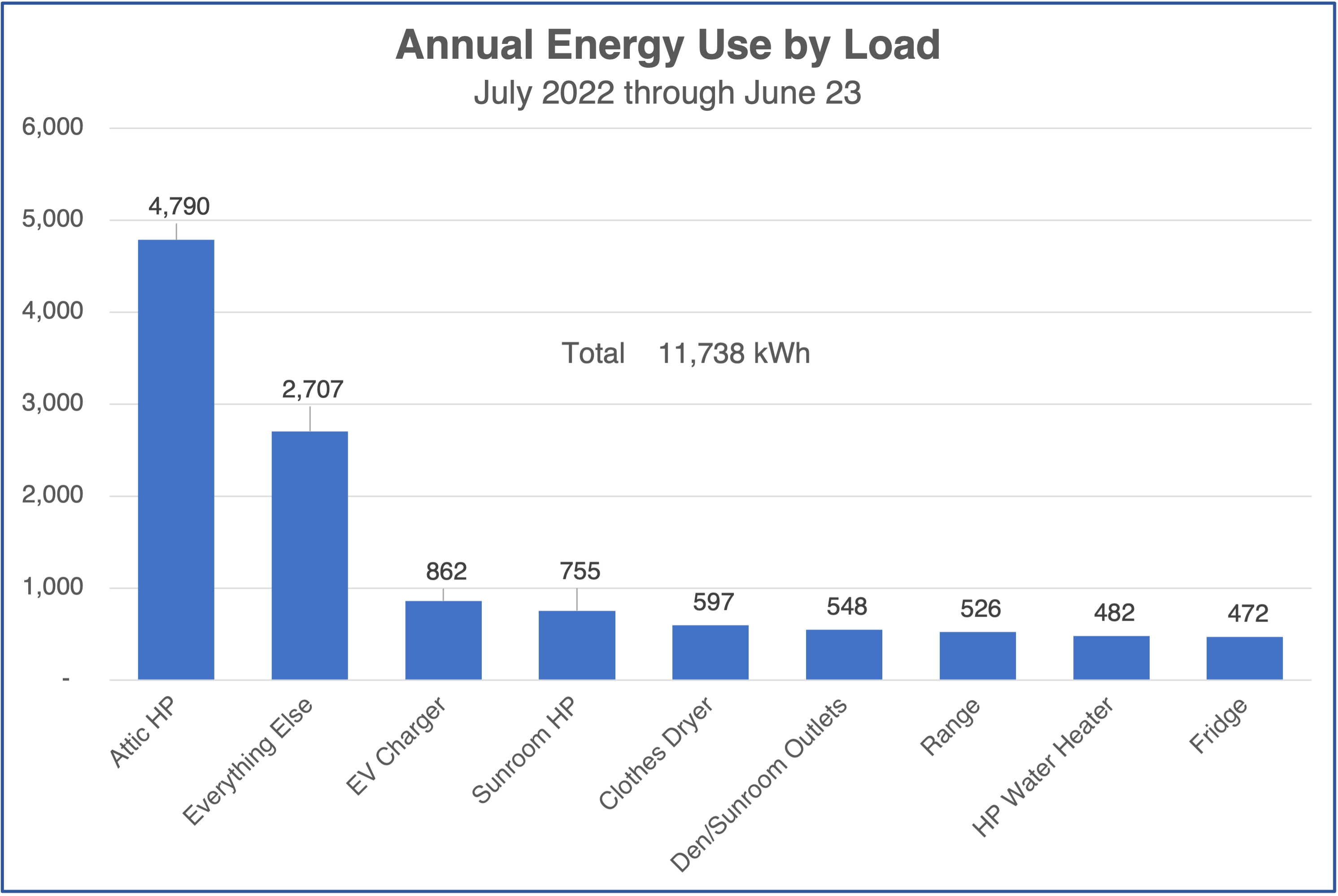
All the other individual loads are less than 1,000 kWh for the year. When I subtracted all the individual loads from the annual total, I found the energy used by everything not named. The “everything else” accounted for 2,707 kWh, or 23 percent of the total.
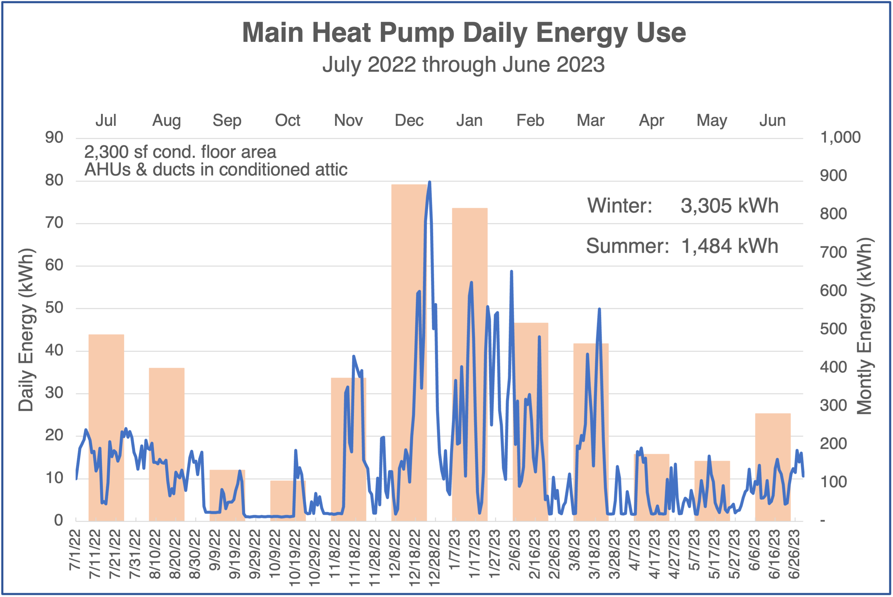
Heating and cooling
The biggest part of our heating and cooling energy goes to feed the inverter-driven heat pump with two low-static air handlers in our conditioned attic. You can see the daily and monthly data for it below. The big takeaway here is that we used 123 percent more energy for heating than for cooling. You can see the numbers on the graph. I’ve been shocking people for decades when I tell them we do more heating than cooling here in Atlanta. Here are the data proving it for one house.
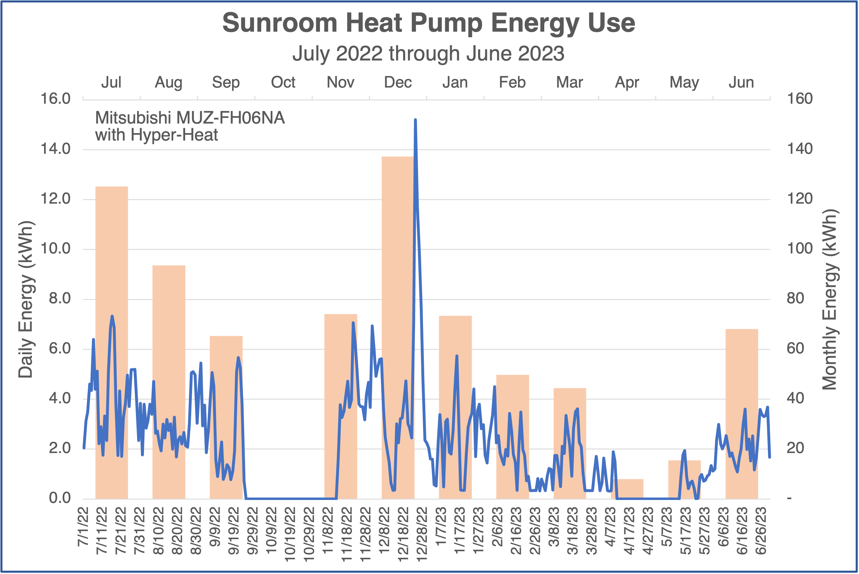
We also have a ductless minisplit heat pump in the sunroom. It uses far less energy than the big one. It’s a half-ton (6,000 BTU/hr) unit, and the total energy it used for the year was 755 kWh.
Another thing I did with the main heat pump data was to plot it along with the heating degree day data. The graph below shows that comparison, and it’s got a few points of interest.
The fall is about the only time that the heat pump curve falls mostly below the heating degree days. Also, note the preliminary spike before the biggest spike in heat pump energy. That was me pre-heating the house (thermostat at ~75 °F) before the single digit Fahrenheit arctic blast that roared through.
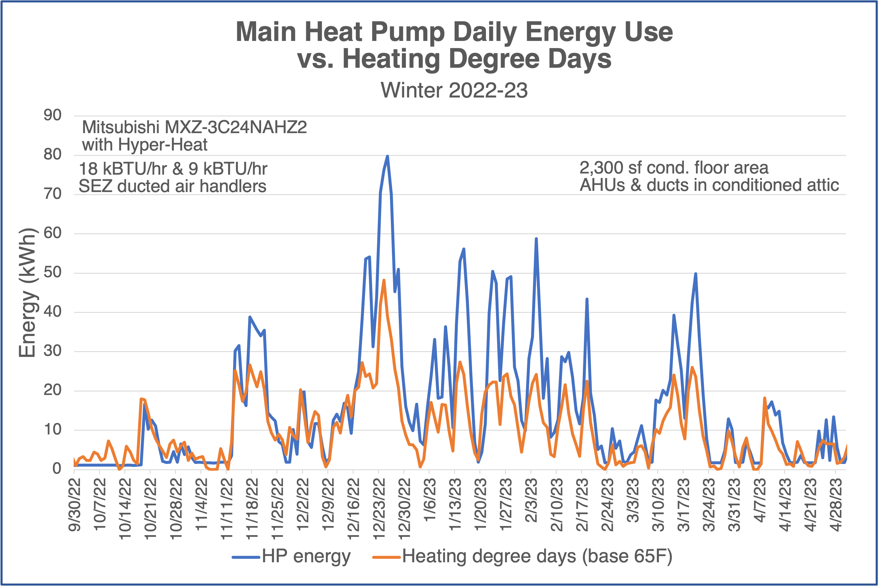
By the way, yeah, I should have added a second axis because heating degree days aren’t measured in kWh. But the numbers were close, and you’re smart enough to get it.
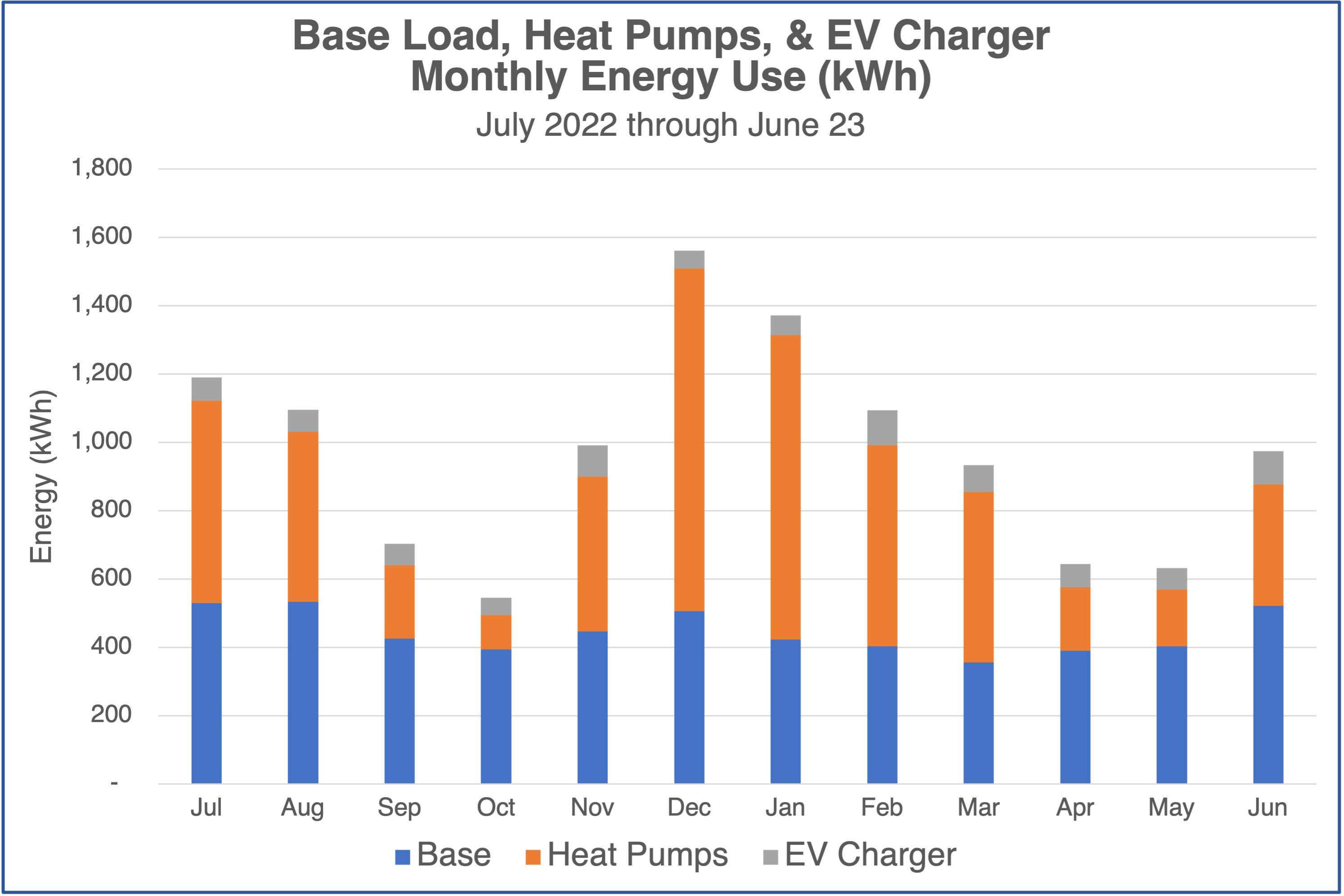
Base load, heating/cooling, and EV charger
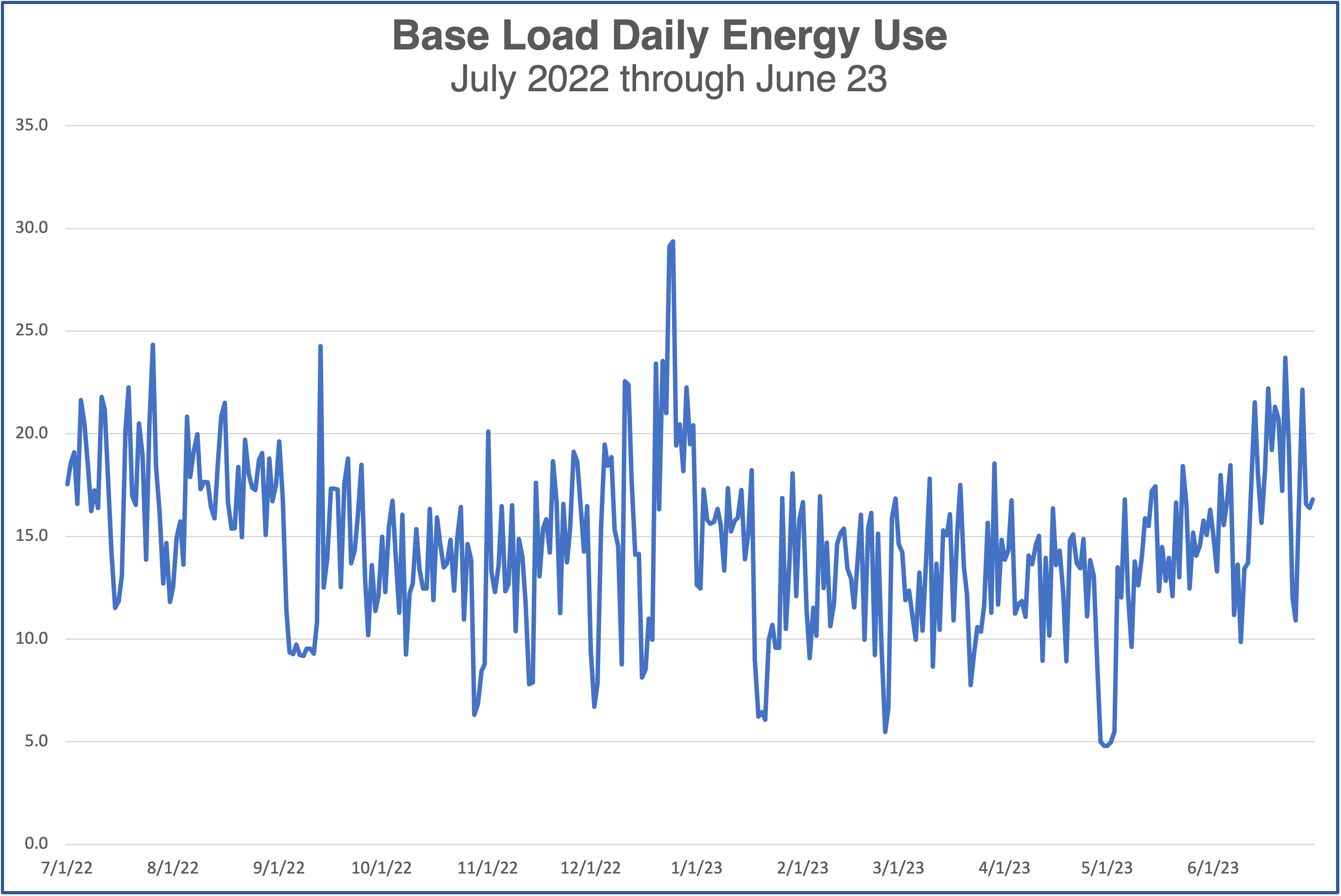
Generally, base load is all the stuff that uses energy besides your heating and cooling systems. In my case, I have a charger for my electric vehicle, so I’m not counting that as part of the base load either. Let’s begin with a look at the daily base load by itself.
Two things jump out at me. First, the big arctic blast spike also spiked our base load. We did have company at the time, so it wasn’t totally weather related. Second, our base load seems to go up in summer.
Now, let’s look at the three big components on one graph of monthly data. You can see the variation in our base load. It’s a 50 percent change from the lowest to the highest. You also can see how heating dominates in winter, and cooling is roughly equal to base load. And then there’s the EV charger, adding a bit each month, for a total of 862 kWh.
Just for fun, I plotted the same graph as percentages instead of energy. Each column adds to 100 percent.
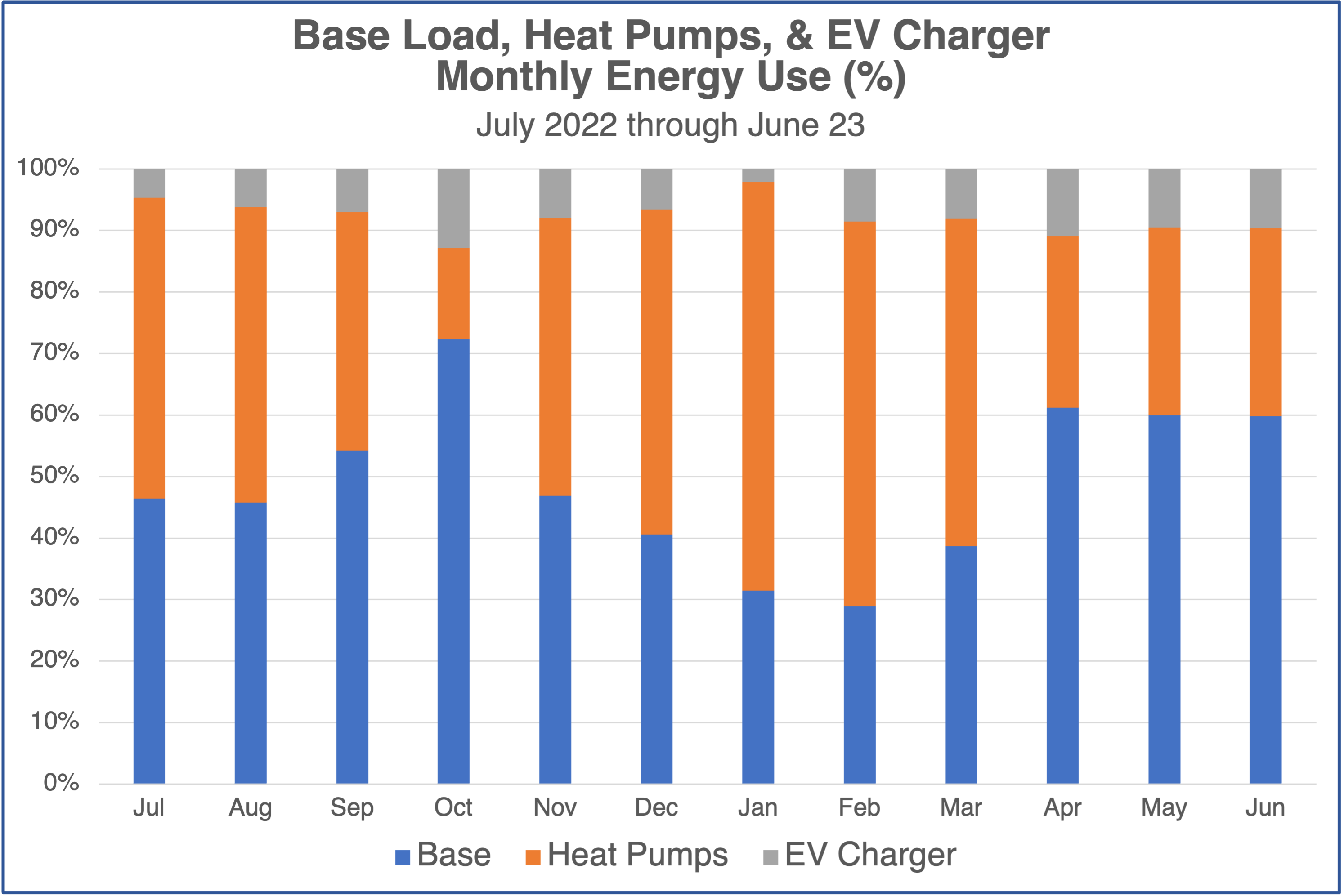
Finding the base load by actually monitoring home electricity use is easier and more accurate than trying to disaggregate it from the whole-house consumption.
Heat pump water heater
Here’s my heat pump water heater data, daily in blue and monthly in columns. The total for the year was 482 kWh. We use more energy to heat water in winter for a couple of reasons. The inlet water temperature is significantly cooler in winter, and the air around the water heater is cooler.
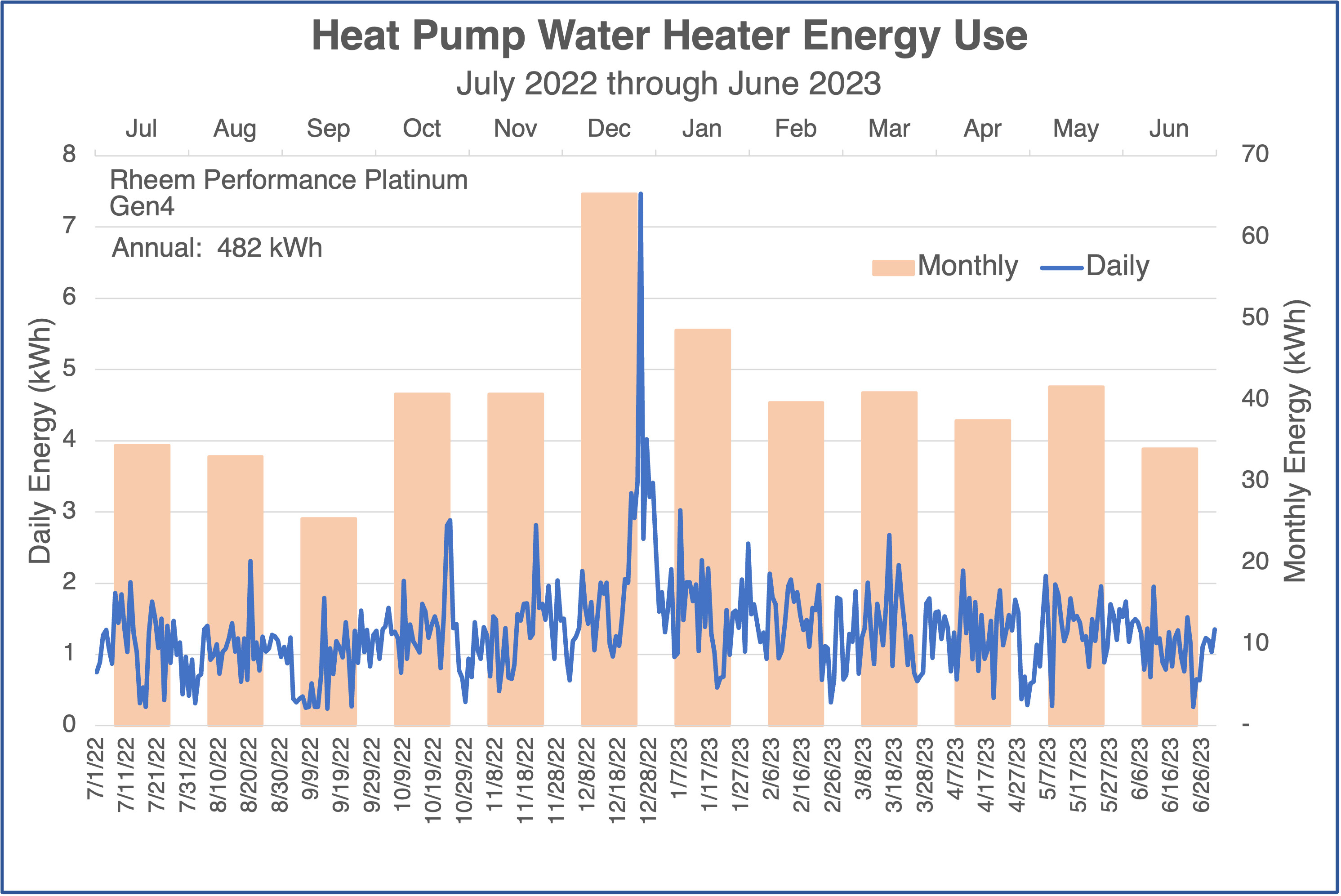
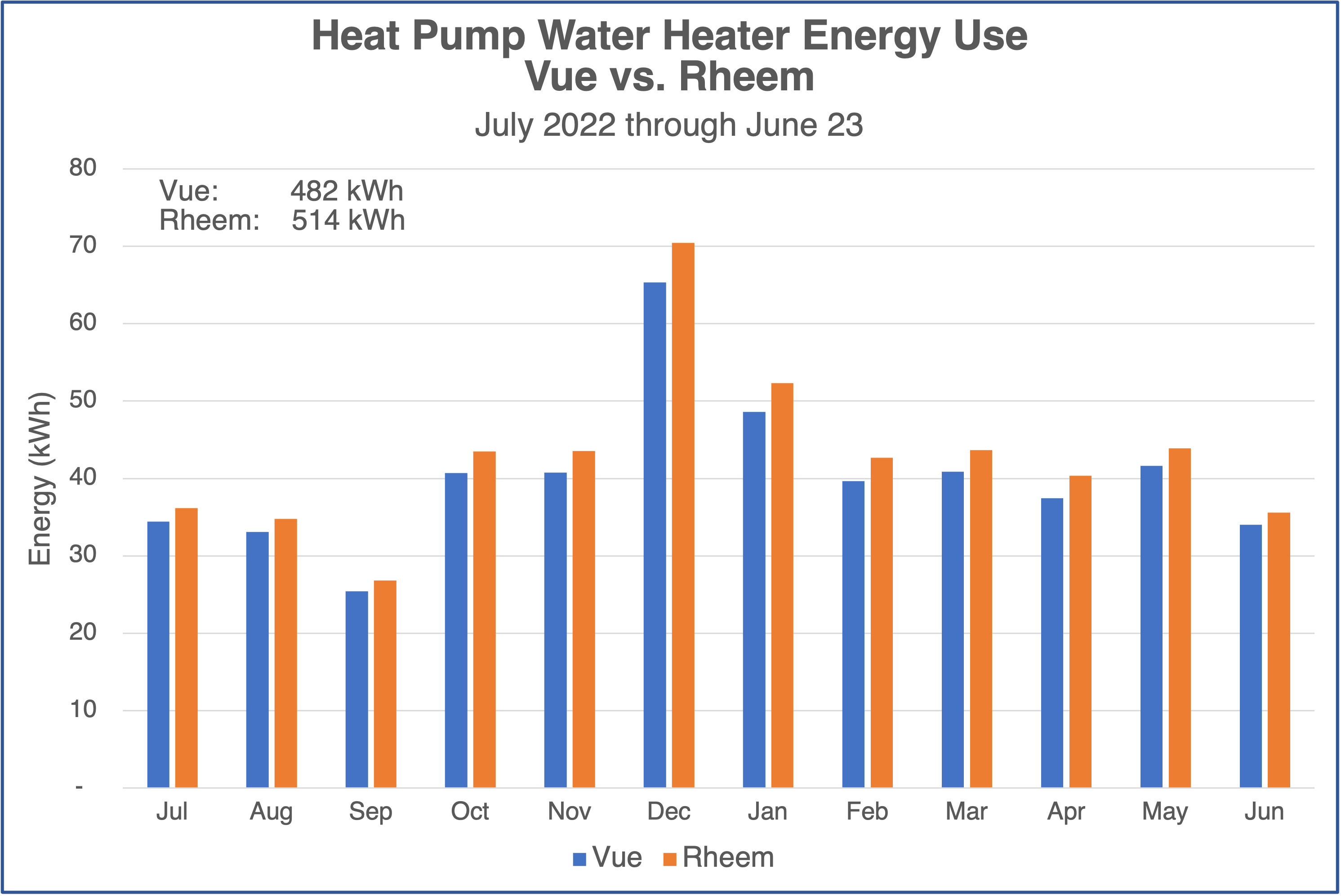
And of course you’re wondering how my Emporia Vue data compare to the data from my Rheem app. Right? The answer is below. This comparison, though, shows that the monthly discrepancies are one-sided. The Vue data are always lower than what Rheem tells me. The net effect was a 32 kWh difference, or 7 percent higher for Rheem data.
See my article on my first year of living with a heat pump water heater for more.
The gist
So there you have a quick, possibly overwhelming, look at the data for my first year of home electricity monitoring. It’s a lot, and there’s even more that I haven’t shown you. I showed graphs only of daily and monthly data here. But when you download the Emporia Vue data, you also get spreadsheets with the data for shorter time intervals: second, minute, 15 minutes, and hour. When you really want to drill down, you have the power!
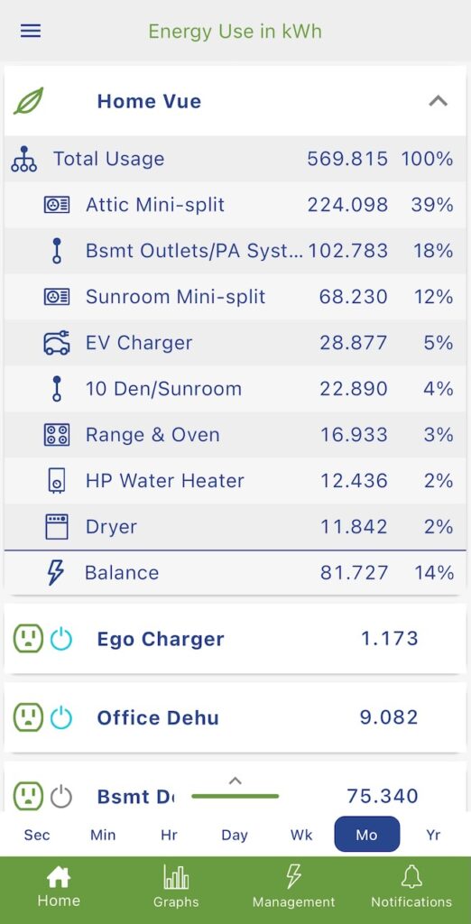
I use the Emporia app constantly. Yes, I check to see what’s happening with my energy use, but I also use it to control some devices. In addition to the Vue data, the app (shown below) also shows me the devices I have on their smart plugs.* I can turn those things on and off and also put them on schedules.
The gist here is that we’re living in the golden age of monitoring. We have great devices that can tell us how much electricity we’re using, what’s in the air we’re breathing, and how many flights of stairs we’ve climbed. If you’re not monitoring electricity yet, why not?
________________________________________________________________________
Allison A. Bailes III, PhD is a speaker, writer, building science consultant, and the founder of Energy Vanguard in Decatur, Georgia. He has a doctorate in physics and is the author of a bestselling book on building science. He also writes the Energy Vanguard Blog. For more updates, you can subscribe to the Energy Vanguard newsletter and follow him on LinkedIn. Images courtesy of author.
Weekly Newsletter
Get building science and energy efficiency advice, plus special offers, in your inbox.


8 Comments
What turned out to be the max 15-minute interval?
I see you have your "Bsmt D" (Basement Dehumidifer, I presume) turned off with the Emporia smart outlet. I've found that monitoring basement or crawlspace humidity levels with a separate remote humidity sensor is extremely helpful for seasonal adjustment. The dehumidifer tends to make run needlessly in shoulder seasons. By having it on a smart switch you can easily just turn it off and save a lot of energy. You just have to remember to turn it back on.
I have the same monitor you do. Are you downloading the information, keying it would be very time consuming.
I wish they could offer a way to 1 click add temperature for your zip as an overlay. I've sent them the suggestion...
Is there a simple way to download and compare to Temp.?
Allison, assuming that your electric dryer is a standard 240v unit, you could probably cut your dryer energy use in half (or more) if you switched to a heat pump dryer!
I installed an Emporia Vue in my recently completed guest house and I'm absolutely loving the granular data! I would love to have that data available for the main house, too, but that's simply not possible with any energy monitor I've come across. The problem is that my service panel is physically coupled with the sealed electrical meter box and the incoming 220v is via a solid bus bar -- there is no room for any coupler to go "around" it (not even the new low profile Emporia clamps). I would need to get my service panel upgraded to use an energy monitor... and at that point, I might as well get one of those smart panels that has monitoring built-in.
Coincidentally I just looked at the data from my energy monitor. These are the average values over a four year period.
Item Average power Percentage of total
plug loads 308 24%
heating/cooling (HP) 254 20% (equiv. 750W)
water heater 215 17%
Oven/cooktop 114 9%
lights 76 6%
Fridge 74 6%
ERV/well pump 71 6%
bathroom floor heat 50 4%
electric bedroom heat 43 3%
dishwasher 38 3%
Dryer 18 1%
Microwave 7 1%
Washer 4 0%
total 1272
Looking at the water heater numbers, it looks like I would save about $90 per year with a heat pump water heater. That's a simple payback period of 44 years at the current, ridiculous, prices here.
Trevor,
So with a heat pump and the well performing envelope you have, there really aren't any obvious ways to chase further reductions that make sense , except maybe plug loads?
I have been measuring Elec & Gas for years.
Monthly bills work well for me. And Temperature data is a must on charts.
Elec data got serious in 2005. Gas data starts 2011. Rarely a similar monthly day count or matching dates in bills.
To make data equal days for comparison is critical. A bit of math.
(Monthly Usage divided by actual days) X 30 days. (500/29)*30 =517.24 for example
This gets a more accurate picture for temperature comparisons over years. Very useful data for me.
Long Island,NY averages 25 cents a kWh. I'm happy with my progress so far.
Air Sealing & insulation lowered gas usage by 18% from years previous with same temp months with no change in gas appliances.
But, dehumidification increased. Creating a learning curve in October 2020.
I now monitor Humidity in Crawlspace, Attic,and Indoors and have lowered crawlspace humidity. Using Desiccants and Dehumidifier.
But, I really need a crawlspace dehumidifier. AprilAire... Give me a test unit.
Log in or create an account to post a comment.
Sign up Log in